

Inside Trump's rebranded meme-fuelled digital White House
As internet reshapes how power is seen, felt, and shared, the aesthetics of governance are no longer an afterthought but strategic

 Updated Monday Jun 02 2025
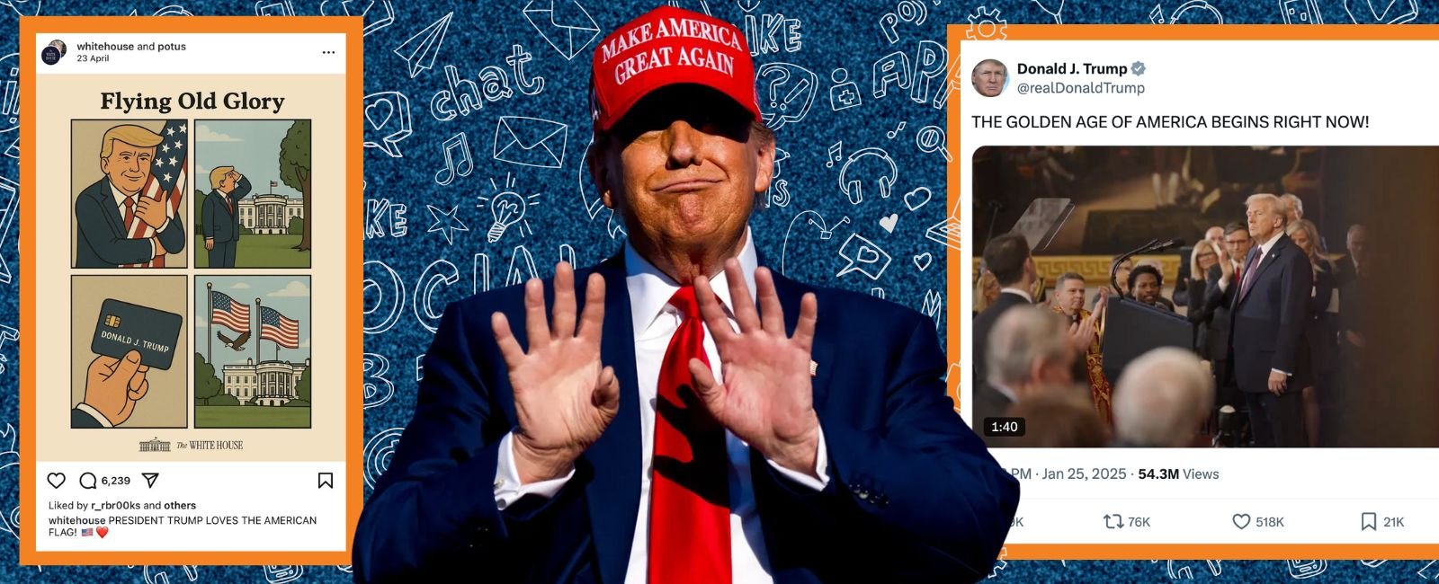
"America is Back!" proclaims one official video. "Thank you for your attention to this matter," reads another post. But scroll through the White House website today, and you’re greeted with a bold new tagline: "The Golden Age of America Begins Right Now." Prominently featured across the page are solo portraits of the president.
Is the 47th US President’s digital strategy designed to boost virality and deepen division through unfiltered rhetoric, emotional outbursts, late-night posts, and memes?
Geo.tv reached out to experts to explore an underreported shift in American political communication: the White House’s digital rebranding since Donald Trump returned to office, marked by changes not only in content and tone, but also in typography, visual design, and language.
Power through design
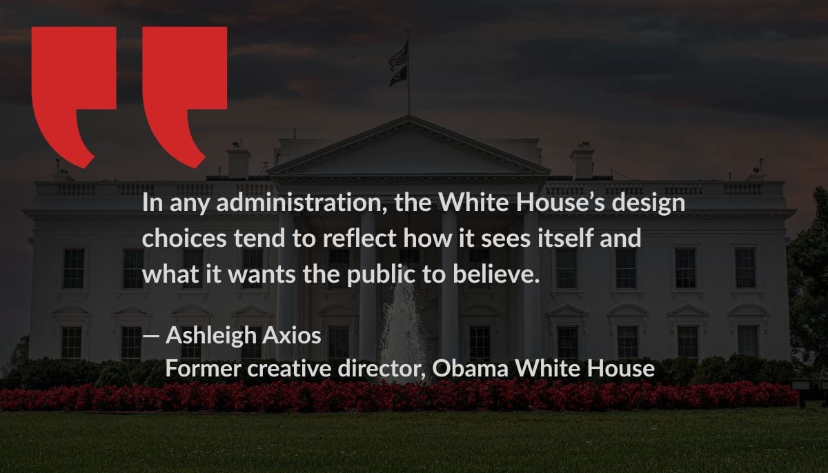
"Design is never just decoration — it’s communication, intention, and power made visible. In any administration, the White House’s design choices tend to reflect how it sees itself and what it wants the public to believe,” says Ashleigh Axios, former creative director in the Obama White House, currently running a public-sector innovation consultancy.
Reflecting on her tenure as creative director in the Obama White House, Axios characterises the shift in digital communication strategies under the current administration, with a focus on typography and visual aesthetics.
“At the start of the Obama administration, we leaned on traditional presidential design cues — serif fonts, dark blues, and ornamental flourishes — to help convey stability and legitimacy, particularly for a president stepping in as a relatively young, junior senator.
"But as the administration grew into its voice, we were able to evolve those aesthetics to reflect a more modern, clear, and people-centred vision.”
In contrast, she said, when the Trump administration first took office, they copied and poorly edited the Obama-era website, leaving behind broken links and mismatched content.
"That initial carelessness was itself a message — a visual reflection of disorganisation, disregard for continuity, and an absence of thoughtful planning."
From the 45th to the 47th President, leading ‘the Golden Age of America’, with Trump’s return to the White House, those observing can notice a more deliberate design language.
“Typography choices — bold, uppercase, and often cramped—convey a tone of aggression and control, while the use of navy blue with stark white text contributes to that visual severity.
"The WH Wire page, with its all-caps headlines, hyperlinked chaos, and an unexplained ticker scrolling across the screen, feels more like a tabloid spectacle than government transparency,” the former WH official said.
The visuals that one witnesses, at times, make one question if the account is a parody (think of Trump in Pope’s regalia or straight out of a Star Wars film).
“Photography choices reinforce this narrative. Rather than portraying a connection to the American people, we see staged solo portraits of the president, some strikingly reminiscent of vanity shots, framed to elevate a singular persona rather than public service. A particularly telling image shows Trump twisted in his chair at the Resolute Desk, alone, meeting the viewer’s gaze as if performing power,” she said.
When comparing previous administrations, particularly Obama’s more polished, minimalist style, how can one characterise the aesthetic shift now?
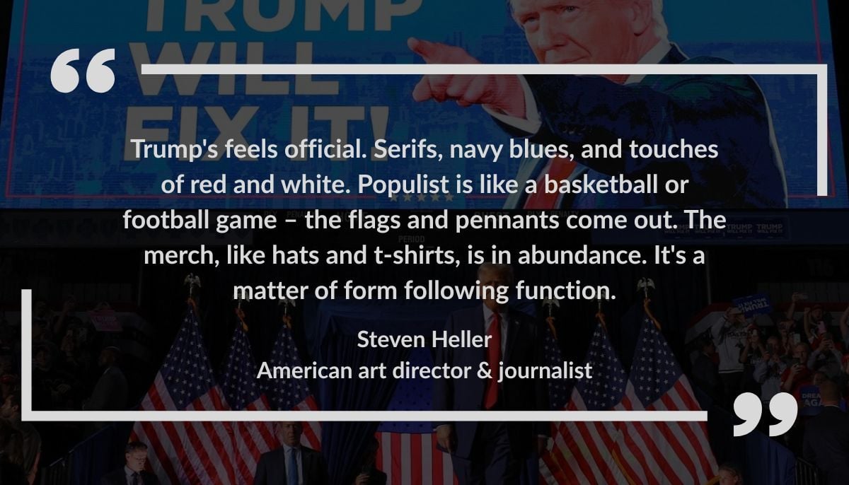
For Steven Heller, an American art director, journalist, critic, author, and editor specialising in graphic design, “Obama was the turning point for graphic design as a branding tool. Trump's campaign decisions were always to play down the glam and play up the MAN. Other than that, his(Trump) typography is clean and clear without the panache of Obama.”
Speaking of design choices — fonts, colour schemes, graphic treatments – and how they influence whether political communication feels “official” versus “populist” or “grassroots”, Heller states, “Trump's feels official. Serifs, navy blues, and touches of red and white. Populist is like a basketball or football game — the flags and pennants come out. The merch, like hats and t-shirts, is in abundance. It's a matter of form following function.”
Weaponising aesthetics
From witnessing design that publicly displays mugshots of immigrants arrested by ICE on White House grounds, Axios stresses that ethical design, working with counsel to ensure our choices uphold public trust, was prioritised under the 44th President. +Speaking of the mugshots of immigrants arrested by ICE, according to Axios, ‘raises serious ethical and legal concerns.’ “It’s a tactic many have described as morbid spectacle — weaponising design to intimidate rather than inform.”
For her, design is never neutral. “What we’re witnessing is not just a shift in aesthetics but a deliberate effort to reshape public perception through visual force. And that, too, is a kind of governance.”
The current administration’s digital content often features bold typefaces, high-contrast graphics, and populist language. What does this entail for the communication office’s objectives and audience engagement?
“President Trump has long positioned himself not as a man of the people, but as someone embedded within — and seeking favour from — the most powerful institutions in the world: billionaires, corporations, and authoritarian leaders.
"Trump's communication strategy mirrors this alignment,” according to Axios.
“The current design language borrows the look of populism — using oversized typography, saturated color, and simplified messaging — but the intent is quite different.”
Speaking of intent, Axios mentions that while the style suggests accessibility and strength on "behalf of the people", the substance reveals a deep alignment with elite power and personal brand-building — by “selling Trump as a singular force — untouchable, central, and beyond the office he occupies.”
Heller doesn’t see a lot of change from Trump’s first to the current term when it comes to the use of typography and visual design in political communication.
“His website is contemporary yet conservative. I guess you'd call it statesmanly. But the flood of Trump photographs underscores his cult of personality,” he said.
In the world of political branding, there seems to be a thin line between creating a visual identity that feels 'strong' versus one that feels 'aggressive' or 'combative'.
“It comes down to the way type is set in relation to what it says. Make America Great Again (MAGA) is a severe word that stands for a combative directive. When you see MAGA on shirts, flags, on posters with TRUMP's name, which has been tweaked to sound aggressive, you can feel it,” comments Heller.
Meme tactics and misinformation
As the Trump team’s digital content grows increasingly optimised for virality and emotional impact, is its visual design being sharpened to match the era of hyper-partisan political branding?
“Any time an image or text goes viral, it will ignite some response that builds like a wave, crests, and then the next one does the same. I think Trump is showman enough to know that optics is what gives him "charisma". It is instinctive – like his raised fist and the word "FIGHT" when he was wounded in Pennsylvania,” shares Heller.
Dr Claire Wardle, an Associate Professor in the Department of Communication at Cornell University, focuses on user-generated content, verification, and misinformation in her research. When asked how the White House’s visual choices shape the way audiences process and trust political information, she said, “To me, as someone who has studied misinformation and conspiracy for some time, the visual cues being integrated into official White House content looks very similar to the sort of viral, memetic content that is particularly popular in participatory disinformation spaces. While there isn’t good academic research, there was a report by Jigsaw in 2019 that included interviews with over 60 people who believed conspiracy theories, and it was clear that ‘low quality’ design choices made them see the content as more authentic.”
With the digital strategy appearing to be designed for virality — short, sharp language and emotionally charged visuals, does this style contribute to the polarisation of political discourse or the spread of mis/disinformation?
“The style they’re using is very effective for sharing information in networked online spaces. People increasingly want very visual, simple, engaging content. This is what the White House is doing,” according to Dr Wardle. However, she notes that there lies a bigger issue – the ways in which other ‘trusted’ institutions — universities, most government agencies, think tanks — visualise their content, which is the opposite. “Their output tends to be very text-heavy, relies on PDFs and press releases, objective, reliant on dry facts and data, and tends to be about ‘broadcast’ rather than interactive sensibilities. I’m not saying we need an information ecosystem completely full of emotional memes, but there does need to be a reckoning around how to communicate effectively in 2025.”
When asked if visual and rhetorical choices made by official government channels blur the lines between information, propaganda, and persuasion? For Dr Wardle, from her experience studying how people consume digital content, “It’s less about the visual design, it’s more about the messaging.” She cites the example of US Homeland Security Secretary Kristi Noem filming herself in front of a jail cell in El Salvador.
“That was an example of propaganda. If she had filmed that in front of the Department of Homeland Security’s building, talking about her trip and why she was going, that would have been an effective form of communication in the contemporary information environment,” Dr Wardle discusses Noem’s social media video that was filmed inside the controversial mega-prison in El Salvador with the deported Venezuelans incarcerated in the backdrop.
Trust, tone, and digital governance
How important is the tone and aesthetic of official communication in building or eroding public trust in institutions, especially in a post-truth media environment?
“It’s critical. And I would say many of the ways that the White House is using social media COULD improve trust if it was based on accurate information that followed government ethics and norms.
"It’s the content that’s the problem, not so much the design. It might feel jarring to see highly visual content coming from the White House, but it’s a recognition of the changing culture powered by the internet.
"In the same way as people felt uncomfortable when newsrooms moved their content to Instagram and TikTok, those concerns have lessened,” says Dr Wardle.
For Macon Phillips, former White House Director of Digital Strategy under President Obama and currently CEO of Starling Strategy, his team’s focus was on three major goals.
“First was amplifying the president's message so we could bring what he had to say about things to people where they were getting information, which was rapidly changing from a few traditional sources to many more, and we wanted to expand that scope.
"The second was being accessible and really making the work of policy and the president's positions and what he was advocating for clear to people, whether that was education reform, healthcare reform, or what have you, through the White House website, through the people that worked at the White House, through digital media.
"The third was giving people meaningful opportunities to participate in their government."
He added that the major example of this was the petitions platform, but his team also sought to bring in new voices to collaborate with policymakers on a variety of things and saw digital tools, certainly from what they saw on the campaign, as an opportunity to really bring more people into the process of government.
When asked about the risks and rewards of prioritising virality over traditional decorum in digital governance, Phillips recalls a related question.
“We had often asked, which is, what does it mean to be presidential? And what is this idea of the office itself and the decorum around it?
"One has to accept that, to date, this office, given that it's only been held by white men, fits a certain perspective of normalcy.
"And just by being the first African-American president, we were pushing the bounds of the traditional definitions of this office and certainly arrived there through a campaign that embraced new kinds of communications and really caught up with a lot of expectations from regular media consumers who wanted to see things in videos or in more accessible format.”
All of this was done while Phillips’s office embraced the idea of making things beautiful and effective visually which was looked at through font choices among other things.
“If you are mean and vindictive, it doesn't matter the kind of font you choose," he underscored.
"That this White House chooses to make their messages seem more polished by using visual tools is fine, but it doesn't get away from their core message.
"And I think the language they are using to justify cruelty and to attack the weakest in our society is a far cry from the way that we use digital media.”
Visual shocks, consistent messaging
When it comes to assessing how much visual branding influences perceptions of strength, legitimacy, or populism in digital political communication, for Phillips, “The credibility comes from it seeming like it's an authentic, real message."
And to some extent, I think Trump himself helps with this by having these typo-riddled all-cap screens that, if anything, show that what you're hearing is exactly what he's saying.”
Recalling instances from the Obama era, Phillips said, “Many times I was involved in politicians who would have layers and layers of approving messages, and ultimately the output would be a very clearly consensus-produced message that wasn't interesting to anyone.
"And so I think it's important that you're able to create something that's interesting and if anything, I think their (Trump’s) visual branding is more about shock rather than consistency — definitely the red hat and some of the other consistent elements, but it seems like they're really trying to flood the zone with a lot of jarring and emotionally triggering images or ideas."
He noted that in his time at the People’s House, his team looked to build trust and understanding through consistent messaging and the visual style followed that.
An outlier era?
Looking at the evolution of White House digital communication over the past 15 years, is this a permanent redefinition of what "official" presidential communication looks like, or is this era an outlier?
Phillips said he was less interested in the norms of digital communication than he was in the norms of the White House itself.
"When the Deputy Chief of Staff is discussing how we might suspend habeas corpus to deport anyone he doesn't like, including mothers and children, it's hard to consider what social media platform that message is best delivered on.
"I feel that the values that are driving this White House are going to destroy any previous convention, and I truly don't understand where we're going to land,” shares Phillips.
Ethos + logos + pathos
Sharing Aristotle’s famously outlined three key elements of persuasive communication: ethos (credibility), logos (logic), and pathos (emotion), Axios, said that when used thoughtfully and in balance, they build understanding and trust.
“But in today’s landscape, that balance is often lost; emotion is frequently over-leveraged to trigger reactions, drive clicks, or consolidate loyalty, not to foster clarity or civic participation.
"When pathos overwhelms logos and ethos, messaging becomes manipulation.”
And that shift is dangerous in political communication.
“When messages are engineered to bypass critical thinking, suppress dissent, or control through fear, they threaten the very democratic values that public communication should uphold,” according to Axios.
Design shifts and democratic accountability
Sharing her observations on the evolution of WhiteHouse.gov, the site’s design and user experience and how that reflects broader shifts in political branding and public engagement strategies, Axios, highlights that the evolution of the website over the past several administrations reflects more than just changing design preferences — it reveals deeper shifts in political branding, public engagement strategy, and even democratic accountability.
“During the Obama administration, we treated WhiteHouse.gov as a civic resource. It was designed not only to communicate policy but to educate, inform, and serve the public — the current administration has significantly stripped back much of that,” Axios shares, mentioning a particularly revealing case.
“The website’s page commemorating the upcoming 250th anniversary of the United States features a stylised video that opens with ominous music and tone, more reminiscent of a horror film than a historical tribute.
"It prominently features the president of Hillsdale College—a deeply conservative institution not known for nonpartisan civic education — discussing the nation’s past in ideological terms.
"The college president repeatedly evokes the themes and language of Trump’s campaign slogan, ‘Make America Great Again’ — a politicised narrative that blurs the line between campaign rhetoric and executive governance.
"This is exactly the kind of entanglement the Hatch Act was designed to prevent — and one we were deeply mindful of in the Obama White House, where we made every effort to keep official government platforms nonpartisan and service-oriented,” according to Axios.
However, the most telling of instances is the removal of the Spanish-language version of WhiteHouse.gov entirely.
“This sends a clear signal about whose participation is prioritised in this vision of American democracy. According to the US Census Bureau’s 2023 American Community Survey, approximately 43.4 million people aged five and older speak Spanish at home, accounting for about 13.7% of the US population (US Census Bureau, ACS 2023 Table S1601).
"Removing Spanish-language access from the government’s most prominent public-facing website doesn’t just ignore that reality — it actively excludes it,” says Axios.
With a narrower, ideologically curated lens of the current occupants of the White House, Axios notes that this administration is a rebranding of the presidency not as a public office, but as a vehicle for political and ideological consolidation.
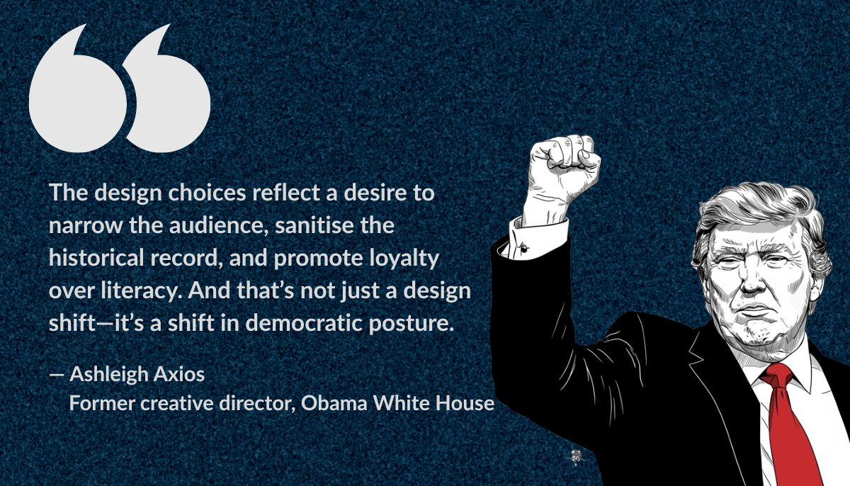
“The design choices reflect a desire to narrow the audience, sanitise the historical record, and promote loyalty over literacy. And that’s not just a design shift — it’s a shift in democratic posture. Emotional spectacle may drive headlines, but it won’t be the future of democratic engagement in a country that still believes in self-governance.”
As the internet reshapes how power is seen, felt, and shared, the aesthetics of governance are no longer an afterthought — they are a strategy. Whether designed to inform or intimidate, the new face of the White House is asking Americans to look closer — and decide what they're really seeing.
Mariam Khan is a freelance journalist and a UN volunteer. She tweets @mariaamkahn
Header and thumbnail illustration by Geo.tv