'The girl you were warned about': Paris 2024 logo mocked online
Parisians got their first glimpse of the new logo when it was unveiled at the French capital´s famous Grand Rex cinema on Monday.
October 23, 2019
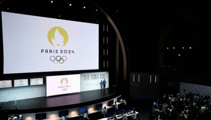
PARIS: The new 2024 Olympics logo is supposed to evoke French history but has instead earned ridicule online for its apparent resemblance to a stereotypical Parisian woman.
Unveiled on Monday, the design incorporates the art deco style in vogue the last time Paris hosted the Games in 1924, depicting an Olympic flame within a gold medal.
It also incorporates the lips and outline of Marianne, the personification of liberty and the French Republic since the revolution of 1789 -- an addition that some mocked for adding an unnecessarily seductive character to the motif.
"The French Olympic logo tumbles out of bed on a Parisian morning," wrote Paris-based journalist Megan Clement on Twitter.
"She tousles her messy bob, dons breton stripes and ballet flats and whisks down the stairs from her fifth-floor apartment to grab a baguette before enigmatically texting two men who are pursuing her romantically.
"(She) has an expresso and a cigarette for lunch. She hops on a vintage bicycle and pedals past the Eiffel Tower on her way to a cafe where she will sit and read Baudelaire with her fluffy white dog at her feet."
Others compared the flame motif to the logo of dating app Tinder and suggested the silhouette of Marianne brought to mind the retro hairstyle made popular by Jennifer Aniston in the American sitcom "Friends".
"The artist´s muse, the poet´s dream, and the girl your mother warned you about. She´s fashionably late for everything. " said one Twitter user.
"I want to follow the French Olympic logo on Instagram," wrote another.
Parisians got their first glimpse of the new logo when it was unveiled at the French capital´s famous Grand Rex cinema on Monday.
Olympic Games´ logos have endured a rocky and sometimes controversial history.
The design for the 2012 Games in London, which featured shapes inlaid with the year and the Olympic rings, cost in the region of £400,000 ($650,000).
'Compromising position' in 2012
Other critics said that the four segments suggested a couple in a compromising position.
Iran, meanwhile, objected as they claimed it was possible to see the word ´Zion´ in the shapes and took their complaints to the International Olympic Committee, claiming it was "racist".
Rio in 2016 drew criticism when designers were accused of plagiarism.
The dancing and linked arms of three characters, in blue, green and yellow, looked remarkably similar to the logo used by US philanthropic organisation, Telluride.
Fred Gelli, the creative director of the Tatil agency that won the design competition for Rio, admitted on the Terra Magazine website that there were "similar elements" with the symbol of the American foundation but also with Henri Matisse´s painting, "Dance".
"It´s a coincidence," he said. "Human figures dancing in a circle" was a "universal symbol".
Organisers of next year´s Games in Tokyo also faced charges of plagiarism leading to its original logo design being abandoned in 2015.
The point of contention was the stylised letter ´T´ which formed the centrepiece of the logo.
A Belgian graphic designer, who created the logo of the Theatre de Liege, filed a complaint against the IOC, insisting the Japanese designer had lifted his ideas.


