WhatsApp's 'ugly' green redesign leaves users disgusted — How about you?
"Omg is WhatsApp taking revenge or something??" one user wrote
Published February 29, 2024
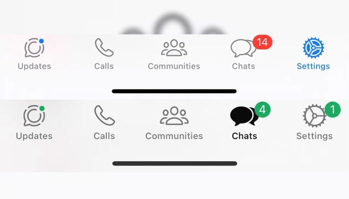
WhatsApp users find themselves puzzled by a recent redesign that has replaced familiar blue and red icons with what some describe as 'ugly' green ones, though not all users are experiencing this change, The Sun (US) reported.
Previously, the design for Android devices featured green icons, while iPhones sported blue ones. However, iPhone users are now encountering green icons within their WhatsApp applications, marking a departure from the traditional colour scheme.
Reports of this colour swap surfaced several months ago among iPhone users, but it seems to have extended to other users more recently. A Reddit post from four months ago captured users' confusion and dissatisfaction.
One user, who described the shade as "ugly", asked: "Omg is WhatsApp taking revenge or something??"
Recent complaints on social media platforms like X (formerly Twitter) indicate widespread discontent among users encountering the green icons in their messenger app.
Some express frustration and difficulty focusing due to the unexpected change, while others note that their icons have been green since the previous year, adding to the mystery.
Speculation abounds regarding the reasons behind this selective colour swap, with some suggesting that Meta, WhatsApp's parent company, may be working on a new app design.
However, Meta declined to comment on the matter when approached by The Sun, leaving users to ponder the motives behind WhatsApp's enigmatic green makeover.


