Meghan Markle's new brand broken down: ‘Desperate for prestige and status'
Meghan Markle has just been accused of ‘role playing’ a royal after losing HRH titles
Published March 15, 2024
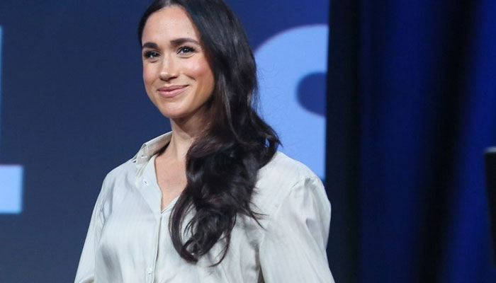
Meghan Markle has just been called out for trying to ‘look and act’ royal via her ‘role play’ brand calligraphy.
Consultant graphologist Tracey Trussell issued these sentiments while trying to breakdown her crest and calligraphy.
She weighed in on everything during a candid chat with The Sun.
She began by referencing how the brand in question, American Riviera Orchard focuses more on her royal heritage than anything.
The expert later even went as far as to say, “Stylised writing is equivalent to a persona or role playing, and always uncovers a conscious desire to project a cultured image.”
“In other words, it’s a false self. It tells of a person who wants to stand out and be different - someone special.”
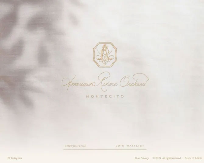
“The cursive handwriting falling obliquely forwards reveals her barely contained enthusiasm and passion for her latest brand, and the almost perfect clockwork regularity (and closely dotted i’s) reflect the exacting standards and commitment she’s investing.”
“However, the linear script, with an accent on the vertical and the narrow arched-shaped letters, strongly indicate Meghan’s lack of spontaneity and reveal that she is guided not by her feelings, but by her thinking.”
“The large capital letters with flourishes relate to pride and uncover how much prestige and status means to Meghan."
“If you look closely at the word ‘American’, the letters are visibly increasing in size. This tells of a woman who is outspoken and inclined to hyperbole.”


